It’s said that English is a very difficult language to learn. We have different ways to pronounce, not only certain letters, but groups of letters, all depending on reasons. “I before E, except after C. Or when sounding like A, as in “neighbor” or “weigh,” is a good example. Well, unless you leisurely deceive heirs to forfeit their sovereign conceits. Because there are always exceptions to the rules.
Here’s another exception – a proper name is supposed to begin with a capital letter. Amazon, Facebook, Flickr, Intel, Citibank, Macy’s BP, Vitamin Water and Xerox all follow that rule. However the logos for each of those companies all start with lower case letters.
And there’s one other company that apparently embraces exceptions and goes one step further.
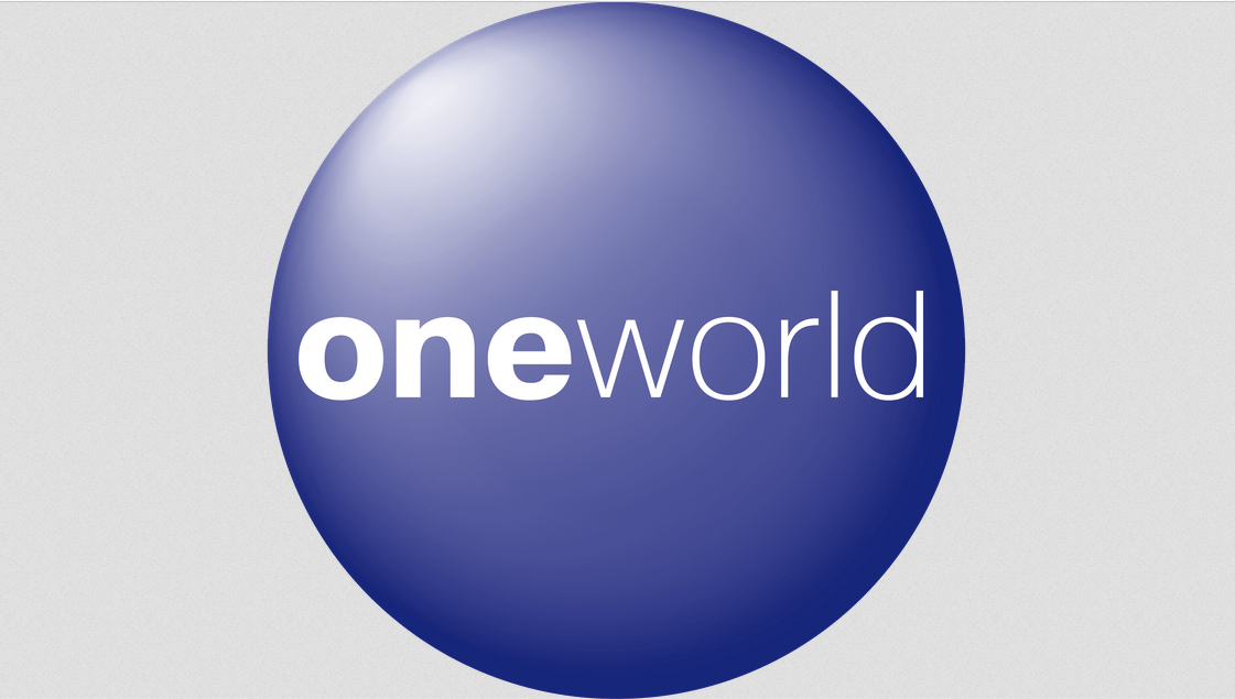
oneworld
The second airline alliance ever made in the world (there are the 3 large ones, Star Alliance, oneworld and Skyteam, and 3 more you rarely hear about), oneworld was announced in September, 1998 and became operational in February, in 1999.
oneworld’s stated objective is to be the first choice airline alliance for the world’s frequent international travelers. And its unstated objective may be to break every capitalization and typography rule out there. 😉
I’m kidding, of course. But oneworld is certainly different:
- They purposely use a lower case O, despite being a proper name
- They purposely use a bold font for the first three letters of their name
Mind you, this isn’t just their logo. This is how they represent themselves and expect their name to be written.
One would think, “OK, it’s a stylization choice. No big deal.” You know, like how the “love” in “I love NY” is represented with a heart. But I knew there had to be more than just that, so I began my research.
I started Googling and found quite a bit of information about oneworld’s logo on 1000logos.net:
Their original logo is a blue circle (meant to be Earth, naturally) with a prominent lightning effect coming from the top left corner of the figure. That gave it more volume and graphically turned it into more of a ball. In practical terms, the lighting (and shading) effects were gradual. The shades were prominent along the edges, all the while the center was heavily illuminated to various degrees.
Along the midline, there was also the company wordmark: written in lowercase letters of a basic sans-serif font. The ‘One’ bit was much bolder than the other portion of the name, which was extremely slim. The coloring was white for these letters.
Although that described the logo (which has remained unchanged since its inception) to a T, it still didn’t explain why that particular logo was decided upon. So I wrote to oneworld’s Press/Inquiries email:
Specifically, why is the name “oneworld,” a proper name, written in all lowercase letters? Along with that, what is the meaning of the first three letters in the oneworld logo in boldface?
Thanks so much!
It took a little while for someone to respond to me. That was totally understandable since, as I said in my letter, Joe and I aren’t TPG (yet), LOL. Even namedropping Randy Petersen (Randy, if you’re reading this, sorry not sorry LOL!) didn’t help.
But then Ghim-Lay Yeo, oneworld’s Vice-President of Corporate Communications, did write back to me. Ghim agreed that it was an interesting question (yeah, we’re really good at quirky) and they were going to look into it for us.
Ghim and I spoke on the phone not long after that, and she gave me a little bit of information. She said the issue with getting the answer was that everyone involved in the decision-making, which, of course, had happened 25ish years ago, was no longer with the company; they had either retired or had moved on. So they were using people who had worked with those folks who had been there back then, to reach out to them.
Ghim she did say that the decision to name oneworld was developed by committee, before the company was announced/operational. She added they did research based on surveys and customer groups to determine the best name, and that’s how the name was chosen.
She continued that once they had the name picked, they still needed to, “Differentiate [themselves] from other companies that used the name Oneworld.” (just as there are other companies nowadays that are named Oneworld – a community health center in Omaha, a non-profit health company for underserved communities around the world, an organization that grows global leaders, etc., such was the case in the late 1990s, as well). She also added they were still working on finding out how the boldface “one” came to be.
By this point, I had gotten wind that oneworld was moving their offices from New York to American Airlines’ campus in Texas. So I didn’t expect to hear from her for a while. Meanwhile, Randy Petersen himself shared some info that he knew, from his years of experience in the travel world:
…and as I recall with oneworld, it was a branding exercise by the agencies, TM Advertising (Temmerlin McClain?) and Saatchi at the time. The goal was to make something distinct, as at the time there was a lot of conjunction of words (SkyTeam later on, as an example), so the decision was made to go *bold on the “one,” to have high awareness on the idea of one alliance among all the originating partners.
Once settled in oneworld’s new offices in Texas, Ghim got back to me with the following statement:
The oneworld name and branding was created through a joint effort involving the alliance’s founding members and creative partners, prior to the alliance’s official launch in February 1999. As part of the process, focus groups with airline customers provided their feedback on a range of potential names for the airline alliance. It was agreed that the name of the alliance should convey the benefits of the member airlines’ combined network. In addition, the name should also resonate across multiple cultures and languages.
The oneworld name that was eventually selected invokes a single, global network offering to customers an array of benefits regardless of which member airline(s) they choose to fly with – with “one” bolded to further emphasize this core asset of the alliance.
More than two decades after its founding, the oneworld brand has continued to endure as among the most recognized names in travel, reflecting the collective strength of the alliance’s member airlines.
So there you go. If you’ve ever wondered why the oneworld name is the way it is, you now know, straight from one of their VPs. And Randy Petersen, too. 😉
Stay tuned for our next quirky topic!
Want to comment on this post? Great! Read this first to help ensure it gets approved.
Want to sponsor a post, write something for Your Mileage May Vary, or put ads on our site? Click here for more info.
Like this post? Please share it! We have plenty more just like it and would love it if you decided to hang around and sign up to get emailed notifications of when we post.
Whether you’ve read our articles before or this is the first time you’re stopping by, we’re really glad you’re here and hope you come back to visit again!
This post first appeared on Your Mileage May Vary

2 comments
Uh, totally awesome, as usual!
LOL, thanks! I don’t think it’d be a good time to look into Southwest’s trucks, so I figured this might be just as good 😉