Matt Shirley is a clever and funny guy. Widely considered a bona fide Instagram star, he’s been making charts and graphs on the social media platform for years. Most have a humorous perspective and unique view on life, and some of them focus on travel.
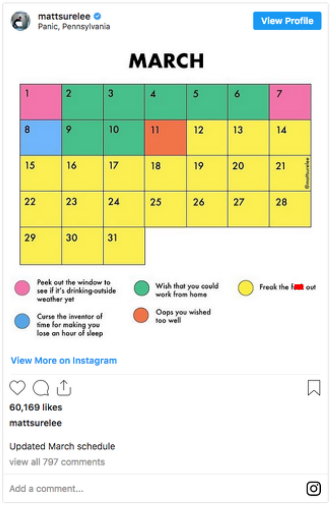
I’ll be honest – I’m not quite sure where he gets all of his ideas from, since they can run the gamut from work conferences to social anxiety to why he hates Valentine’s Day. I mean, his calendar of March 2020 is a classic and 100% SPOT ON!:
But with almost 400,000 followers, he frequently surveys them to help him fulfill some of his graphics.
For example, he asked them for their input into the worst attraction in every state:
I’ll let you in on a little secret – don’t tell anyone, but I don’t care if it’s on the “worst attractions” list…I’ve never been to Casa Bonita and it’s on my bucket list. 😉 Anyway, I know a bunch of Disney fans who might take offense at Disney being the worst attraction in Florida. And by the way, I LOVE Times Square in NYC LOLOL!
But not to worry – he followed it up with the best attraction in every state:
It’s funny how the “worst” attractions tended to be more touristy places and the “best” ones were more nature, parks, etc. Well, except for the Grand Canyon, which was both, LOLOL! And poor West Virginia – apparently nothing there is the most OR the least interesting.
Matt’s had other graphics that were travel-related, as well. For example, he had commentary about having to travel in a foreign country for work:
Restaurant anxieties:
Every airplane seating chart:
What happens, the longer you’re at an airport:
And, of course, potential seatmates on a plane:
You can see more of his charts and graphics on his Instagram page. Heads up that some charts include adult language.
Feature Image: Matt Shirley/Instagram
Like this post? Please share it! We have plenty more just like it and would love it if you decided to hang around and get emailed notifications of when we post. Or maybe you’d like to join our Facebook group – we have 14,000+ members and we talk and ask questions about travel (including Disney parks), creative ways to earn frequent flyer miles and hotel points, how to save money on or for your trips, get access to travel articles you may not see otherwise, etc. Whether you’ve read our posts before or this is the first time you’re stopping by, we’re really glad you’re here and hope you come back to visit again!
This post first appeared on Your Mileage May Vary.
