Interactive COVID Travel Map, Better Than IATA’s, Minus 2 Things

by SharonKurheg

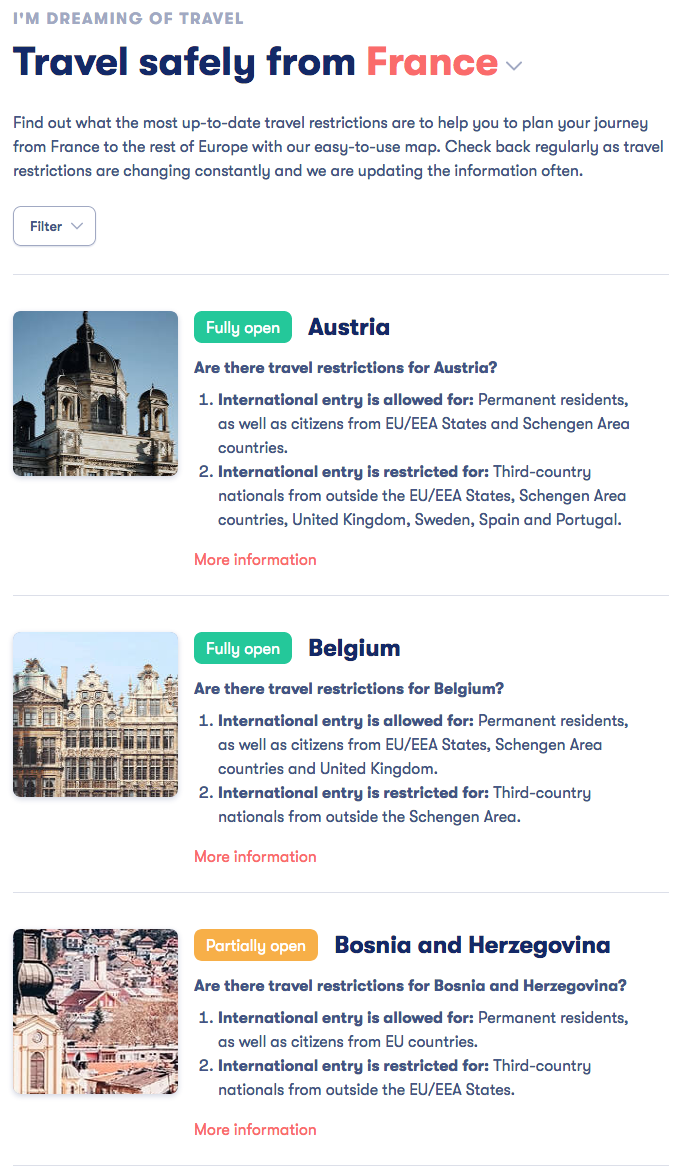
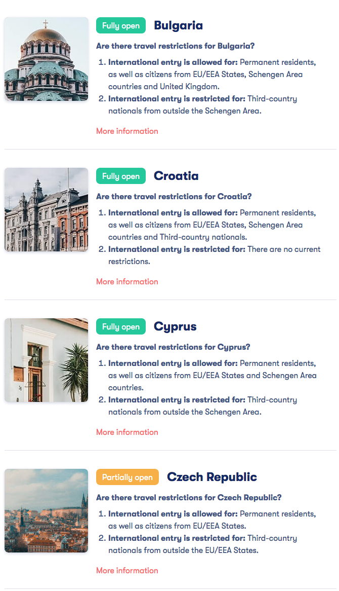
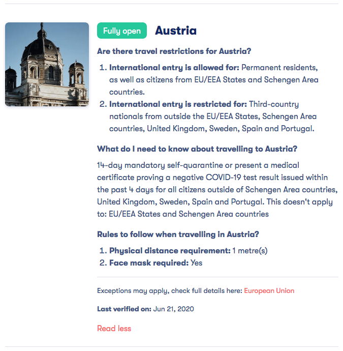
Knowing what’s open, and where we can travel is very “fluid” nowadays. Because of that fluidity, you need to research before you go, to know what countries’ borders are open, as well as any additional information (i.e. quarantine, immediate family members of residents, etc.) before you can decide if or where you’ll travel.

The International Air Transport Association (IATA) has a page that gives the current travel requirements for every country in the world. It’s interactive, updated and thorough; it’s just not super user friendly. I mean, it gives all the info; it’s just, well, dry.

I recently found another online map that is SO MUCH easier to read and understand. It’s done by Omio, which is Europe’s leading multi-modal travel booking platform.
Omio’s Open Travel Index allows users to learn how and when each nation’s travel restrictions are being lifted. So users can easily see what countries they can visit based on their country of origin, overall status regarding travel into and within a particular country and whether non-residents are permitted access.
The interactive map is much more user-friendly than IATA’s. It shows you where you can go based on the departure country, with an easy “red-yellow-green” color-coded system based on the starting point and destination. You can review specific measures that you’ll need to know before traveling there, such as requirements for wearing masks, or certification of fitness for travel.
Here’s an example:
Let’s say you live in France. One of the first things you’ll see is a color-coded map of the area:
Screen Shot 2020-06-22 at 11.07.30 PM

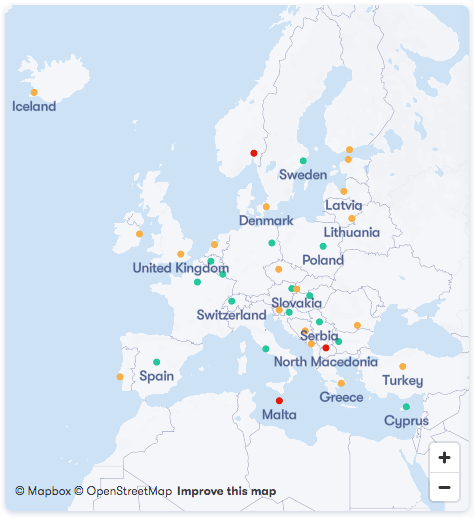
PC: Omio’s Open Travel Index

You also have a list of every country in Europe, with color-coding if a country is fully, partially or not open to you:
Screen Shot 2020-06-22 at 11.09.29 PM
Screen Shot 2020-06-22 at 11.10.35 PM
That’s just 2 pages. It goes alphabetically, all the way to the United Kingdom.
But let’s say you were planning on going to Austria, and wanted more info about traveling there from France. You just click on “More Information” and get all of this:
Screen Shot 2020-06-22 at 11.13.58 PM
Which is just about everything you would need to know about traveling to Austria as someone living in France.
See? It’s simple, it’s user friendly, and it’s thorough.
The website’s biggest 2 problems, as least from an American’s POV?  It only gives info for those 37 European nations, and it gives no info for travel from U.S. countries.
Since the software program is European, I’m admittedly not surprised that it only focuses on Europe. I’m hoping that as cases around the world go down, they’ll include more info for “outside the EU/EEA, Schengen Area countries, U.K., Sweden, Spain, Portugal, etc.,” since that would include us. That way we could use the map for when we wanted to go to Europe, at least.
I really wish they would expand it; it’s so much better than what I’ve found out there so far.

#stayhealthy #staysafe #washyourhands

Like this post? Please share it! We have plenty more just like it and would love it if you decided to hang around and get emailed notifications of when we post. Or maybe you’d like to join our Facebook group – we have 13,000+ members and we talk and ask questions about travel (including Disney parks), creative ways to earn frequent flyer miles and hotel points, how to save money on or for your trips, get access to travel articles you may not see otherwise, etc. Whether you’ve read our posts before or this is the first time you’re stopping by, we’re really glad you’re here and hope you come back to visit again!

This post first appeared on Your Mileage May Vary

Leave a Comment